Visualizing profit margins, shipment efficiency, and customer segment performance using Power BI.
This dashboard presents my take on what an effective, insight-driven presentation should look like for one of the most well-known datasets in data analytics — the Superstore dataset.
1.
Business Problem — What Was the Challenge?
The dataset contains operational and sales data for a variety of products sold across the United States.
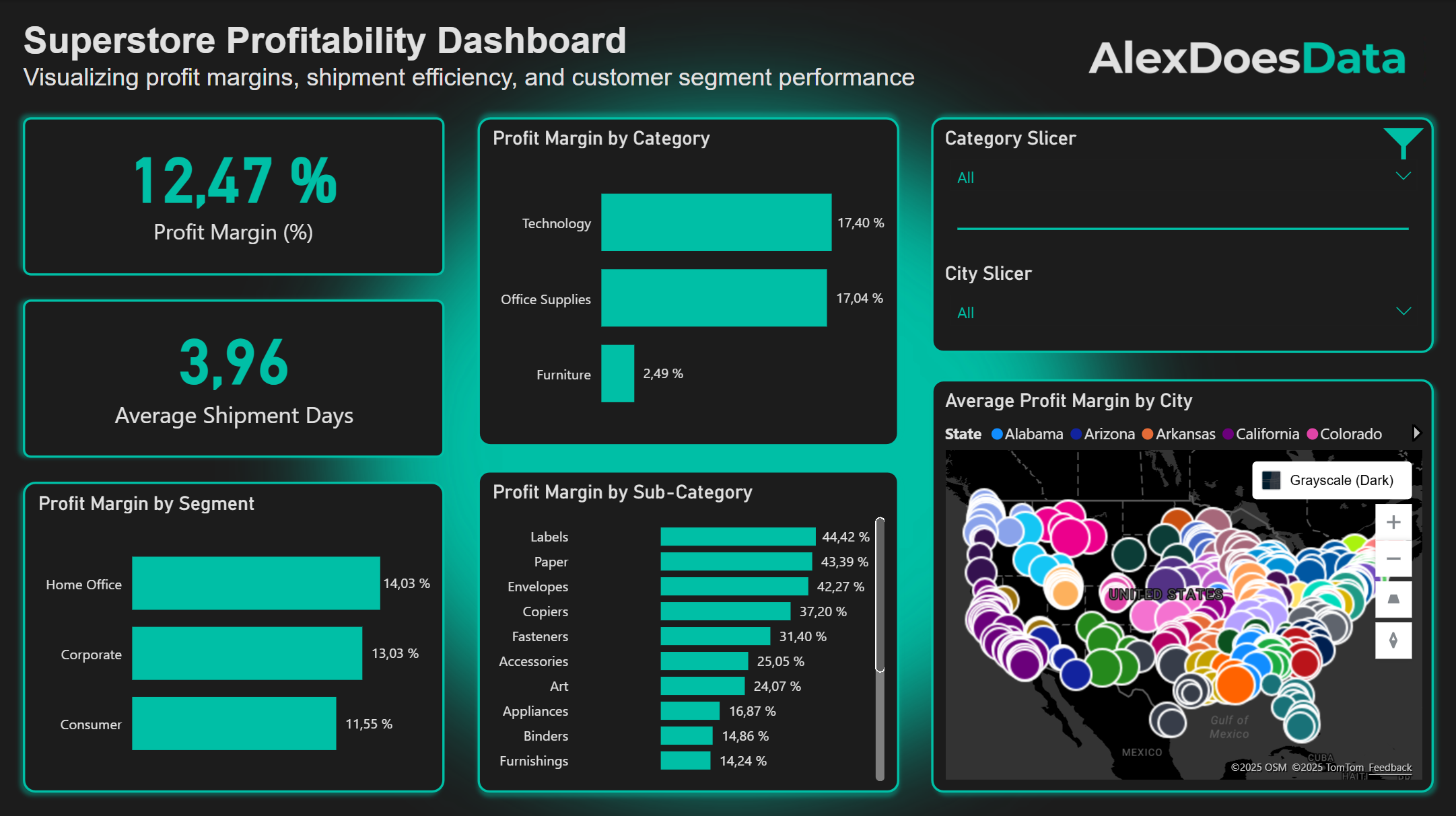
The goal of this project was to identify top- and bottom-performing products, analyze regional and segment-level profitability, and highlight actionable insights that could help improve overall business performance.
2.
Project Highlights
- Built an interactive Power BI dashboard to explore sales and profit metrics.
- Created custom DAX measures for profit margin and average shipment days.
- Designed filters and slicers to allow user-driven analysis by category and segment.
- Crafted a clean, modern UI using a dark theme and teal accents for visual consistency and readability (AlexDoesData theme).
3.
Data & Tools
| Aspect | Details |
| Dataset | Superstore dataset (sample retail data) |
| Data Cleaning | Handled missing values, standardized date formats, and calculated new measures |
| key Measures | Profit Margin = SUM(Profit) / SUM(Sales); Average Shipment Days = AVERAGE(Ship Date – Order Date) |
| Tools Used | Power BI, DAX, Excel |
| Visualization Techniques | Bar charts, map visuals, KPI cards, slicers |
4.
Key Insights
- Technology and Office Supplies are the most profitable categories, both exceeding 17% margin.
- Home Office customers generate the highest profitability among all customer segments.
- The average shipment time is approximately 4 days, indicating strong fulfillment performance.
- Profitability varies significantly by state and city, revealing opportunities for regional optimization.
- Subcategories such as Machines (1.79%), Supplies (-2.55%), Bookcases (-3.02%), and Tables (-8.56%) show the lowest profit margins.
5.
Reflection
Power BI proved to be a powerful tool for creating interactive and dynamic dashboards that clearly communicate insights to a variety of stakeholders.
While it’s not my preferred tool for data cleaning or preprocessing — I usually handle those steps in Python or R — Power BI excels at the visual storytelling aspect of data analytics.
One of its design limitations can be easily overcome by creating a custom PowerPoint background, which I used to give this dashboard a polished and professional look.
6.
Resources
The following resources provide access to the dataset and dashboard used in this project. They allow you to explore the underlying data and interact with the visualizations that informed the insights presented above.